


HOW NOT TO HANG ARTWORK: 5 COMMON MISTAKES
Pippa Foster is a seasoned professional in the realm of interior design with over 7 years of industry experience. With a rich background in high-end residential projects, Pippa has lent her expertise to renowned companies across the north of England. From inception to completion, she meticulously oversees each project, collaborating with diverse teams, crafting intricate technical drawings, and curating captivating interior schemes. Join us as we delve into Pippa's wealth of knowledge and insights, eagerly shared for your inspiration and education. Dive in below!
Choosing artwork in the correct size for your space and framing it properly can be difficult to get right. If you have chosen to frame your artwork yourself rather than getting it done professionally, here are some tips to help you avoid these common mistakes.
1. MIS-HANDLING ARTWORK

Accidents happen, but here are some tips to help protect your precious pieces…
- Rule number one, if framing artwork yourself, always, ALWAYS wash your hands! We would even go as far as to say… wear gloves. There are oils in our skin (even on the cleanest hands) that leave marks and fingerprints, so when handling artwork, always take care to be very careful to touch only the back of the piece.
- An extra set of hands… with prints that have been rolled, the artwork tends to bounce and curl up, which can make it very tricky to handle. Having an extra set of (gloved) hands to roll it out and keep it flat while framing can be beneficial and reduce the risk of creasing the piece.
- Secure the artwork in a correctly sized frame so it is properly protected (more on this further down!).
- Ensure the frame is clean and free from dust or debris. If using glass or acrylic glazing, clean it thoroughly to remove any smudges or residue beforehand, but be careful not to scratch the surface.
2. CHOOSING THE WRONG STYLE OR COLOUR FRAME

A frame colour and style should always complement the artwork and the space it sits in and Pippa is passionate about this…
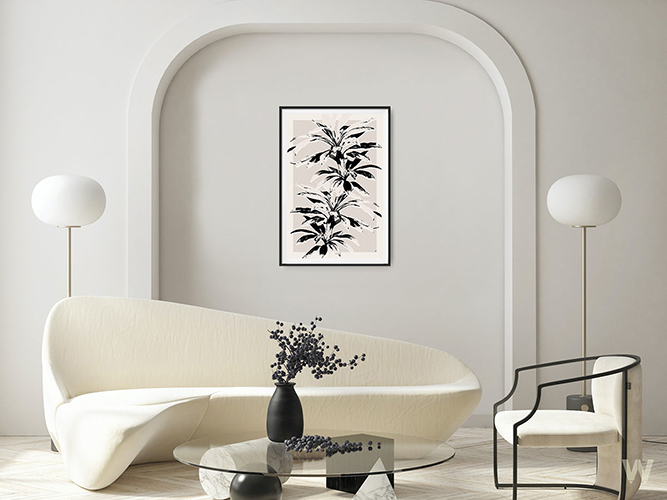
"A frame that is too heavy detracts from delicate artwork, and a frame that is too light can make a bolder art piece seem imbalanced. Traditional artwork tends to suit ornate frames, while contemporary pieces tend to look better in sleek, minimalist box frames.
Ideally, a frame should also accentuate the trimmings and details of the space, e.g. the window trimmings or furniture.
For example, a black box frame with a thin gold or metallic trim might provide just enough delicate detail to complement both the artwork and tie into the larger room’s trimmings but remains simple enough to not detract from the piece and stay in keeping with the general contemporary feel of the room."
3. INCORRECTLY SIZED FRAMES AND NO MOUNTS / MATS

It is essential to select a frame size that complements the dimensions of the artwork and provides adequate protection. If the artwork isn’t secured in place within the frame, it is likely to slide down over time, leaving gaps between the edges of the frame, and ultimately damages the artwork.
Pippa highly recommends using a frame with a mount, as a mount allows a bit of space for the artwork to breathe and draws your eye into the piece.
"If your artwork has off-white tones, a bright white mount is likely to clash. A black mount can be very effective, but will darken the overall feel of the piece, so take into consideration the space the artwork will be located. The mountboard colour must also suit the colour of the frame. In general, an off-white mount tends to work with most artworks and frames and gives a fresh feel.
If your artwork is above 15”, opt for a mount around 2” wide. Using a large frame with a wide mount around a smaller piece of artwork can hugely upgrade how your artwork sits in a space, for example an A2 frame on an A3-sized artwork. Or alternatively using a square-shaped frame with a mount to display a portrait-shaped artwork."
4. BADLY POSITIONED & WRONGLY SIZED ARTWORK

Marking your wall with masking tape is a great way to measure out how large or small your artwork(s) should be. This is a really helpful way to test how the artwork will feel in a room, and we highly recommend doing so before purchasing a piece. Don’t forget to leave room for a frame, especially if you’re sizing up to allow the artwork to breathe as mentioned in our point above!
"I would always recommend lining your art through with something else in the room. For example, positioning the top of the artwork in line with the top of the architrave around a door. Consider eye level as well, the centre of the artwork should typically be at eye level for optimal viewing. In most cases, this is around 150cm from the floor to the centre of the artwork.
Never put a small piece of art on an open wall space where there is nothing to surround the art, for example shelving or lamps, as it will look lost and you won’t be able to appreciate the artwork for what it is. If you're hanging multiple pieces together, test the order of artworks first to determine the desired layout and leave adequate spacing between each piece for visual balance.
Depending on the weight of the art and what plugs & screws are required, always be sure to check the type of wall you are planning to hang the artwork on (a load-bearing wall or plasterboard wall with hollow internal) as this will affect what you can hang, and always be sure to first check before drilling for any radiator pipes running inside the wall.
It’s also worth checking the artwork won’t be in direct sunlight either, as this can lead to fading over time."
5. LOW QUALITY FRAMES

Good artwork deserves good housing and we feel that properly framing a piece of artwork contributes to 50% of the overall final look of the displayed artwork. We aren’t kidding!
"If it is within your budget, avoid low-quality frames where possible. Thin, plastic frames can hugely detract from artwork, cheapening the overall look and most importantly, do not provide adequate protection. Many of these frames warp over time, lose their colour and affect the artwork's overall preservation."
Good quality frames tend to be made with solid wood, the joinery is strong and the backboard which holds your artwork in place is very sturdy and should be acid-free. Your artwork should stay completely secure and should not warp or bend with the backboard. The back of the artwork can be taped at the corners with archival tape to keep it from slipping down over time.
Glass or acrylic glazing should be fitted in place, scratch-free and should not wobble. The artwork should not be touching the glazing, and using a mount helps ensure this. Once the artwork is fully secured in place and the backboard has been attached, it is good practice to also tape around the back seal of the frame to ensure no dust or moisture can get in.
--
If you’re unsure about how to frame your artwork, don’t hesitate to get in touch with our team at WOMNN and we’ll be happy to help. Our team use framing and canvas-stretching specialists who work with sustainable high-quality wood and materials to provide the best protection and aesthetic for our artists' work.
Share this post: